Sanne is a luxury fashion brand challenging convention through a future-focused approach to design, identity and sustainability.

Sanne is a luxury fashion brand challenging convention through a future-focused approach to design, identity and sustainability.
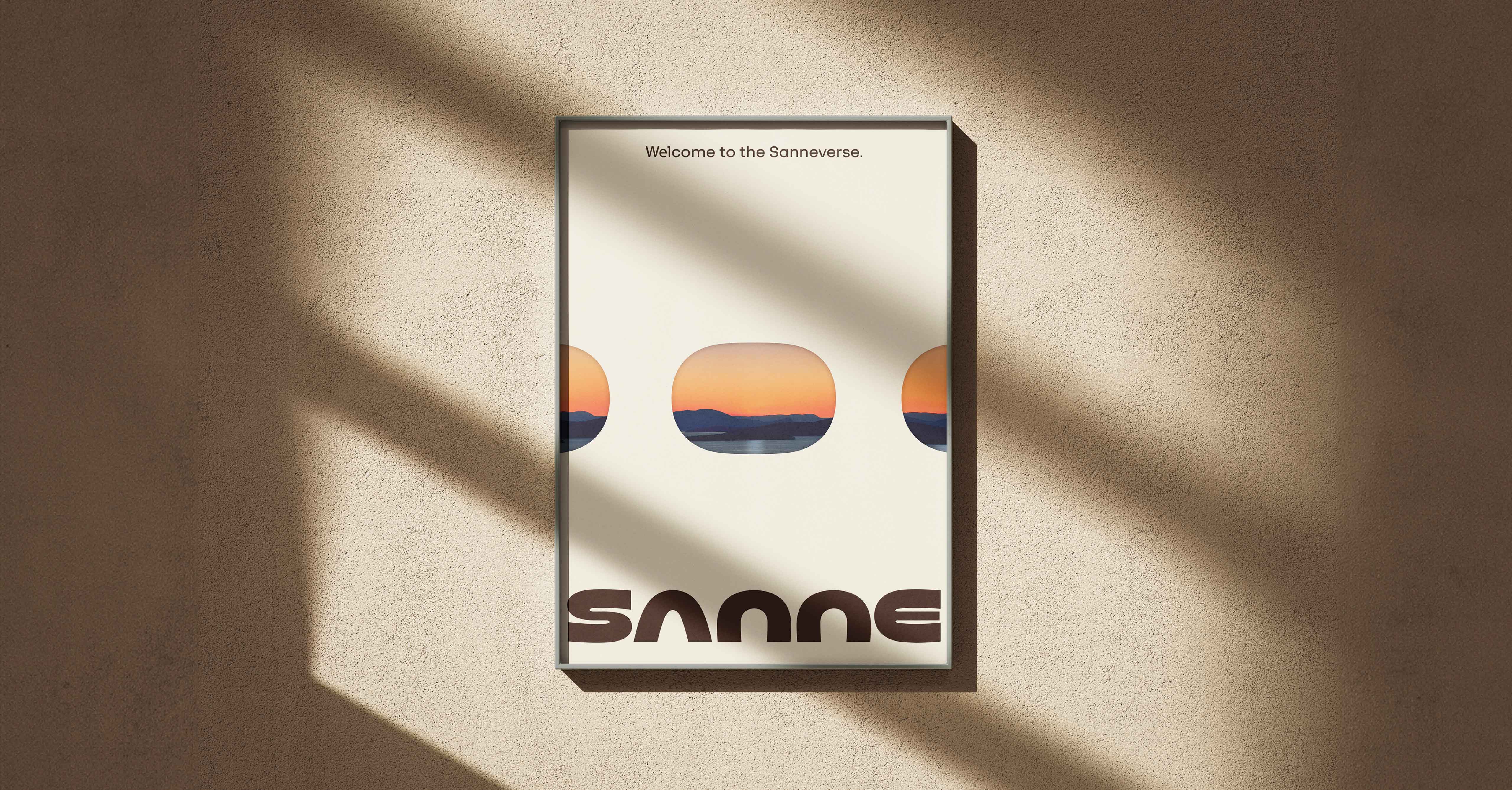
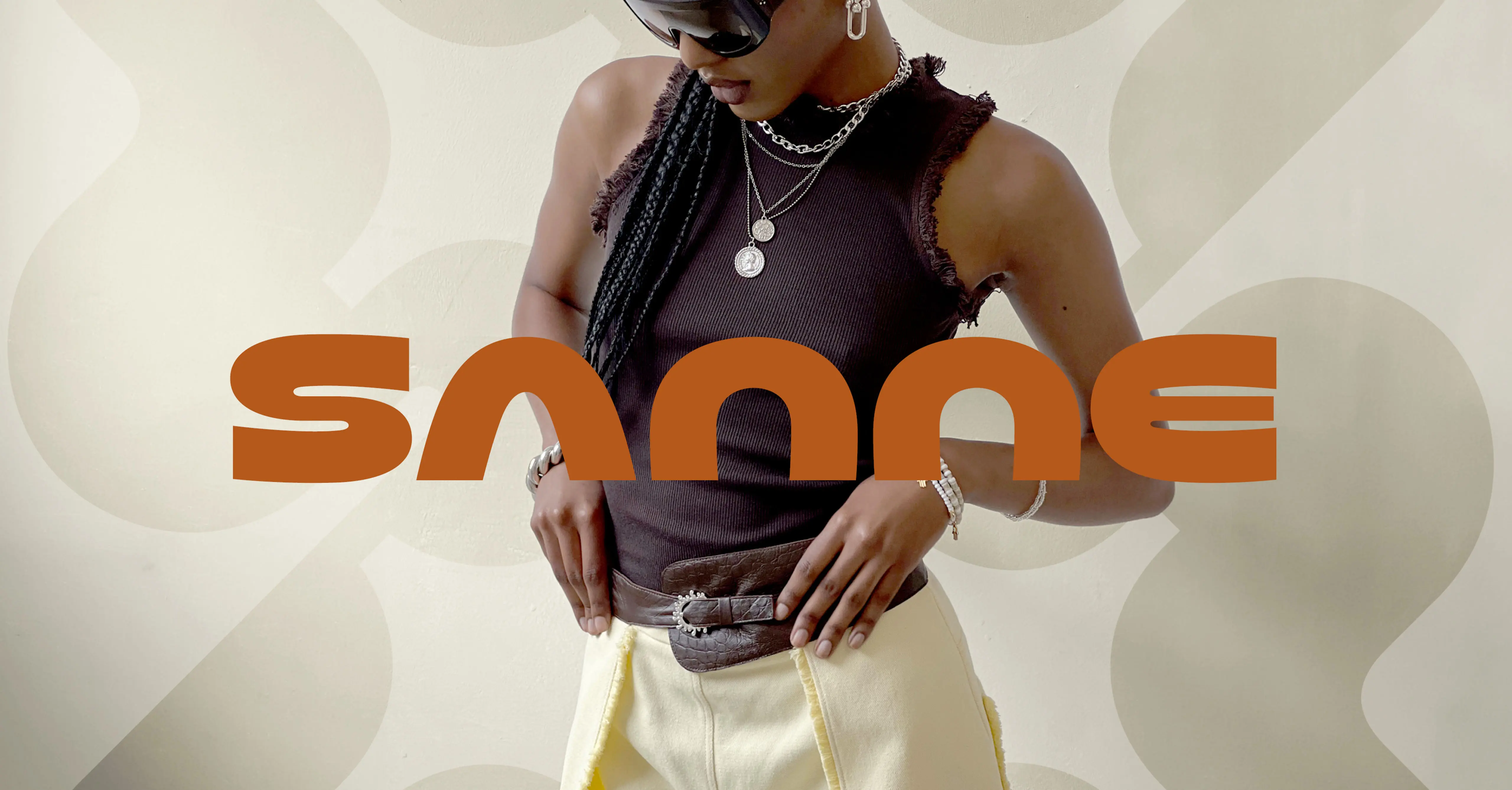
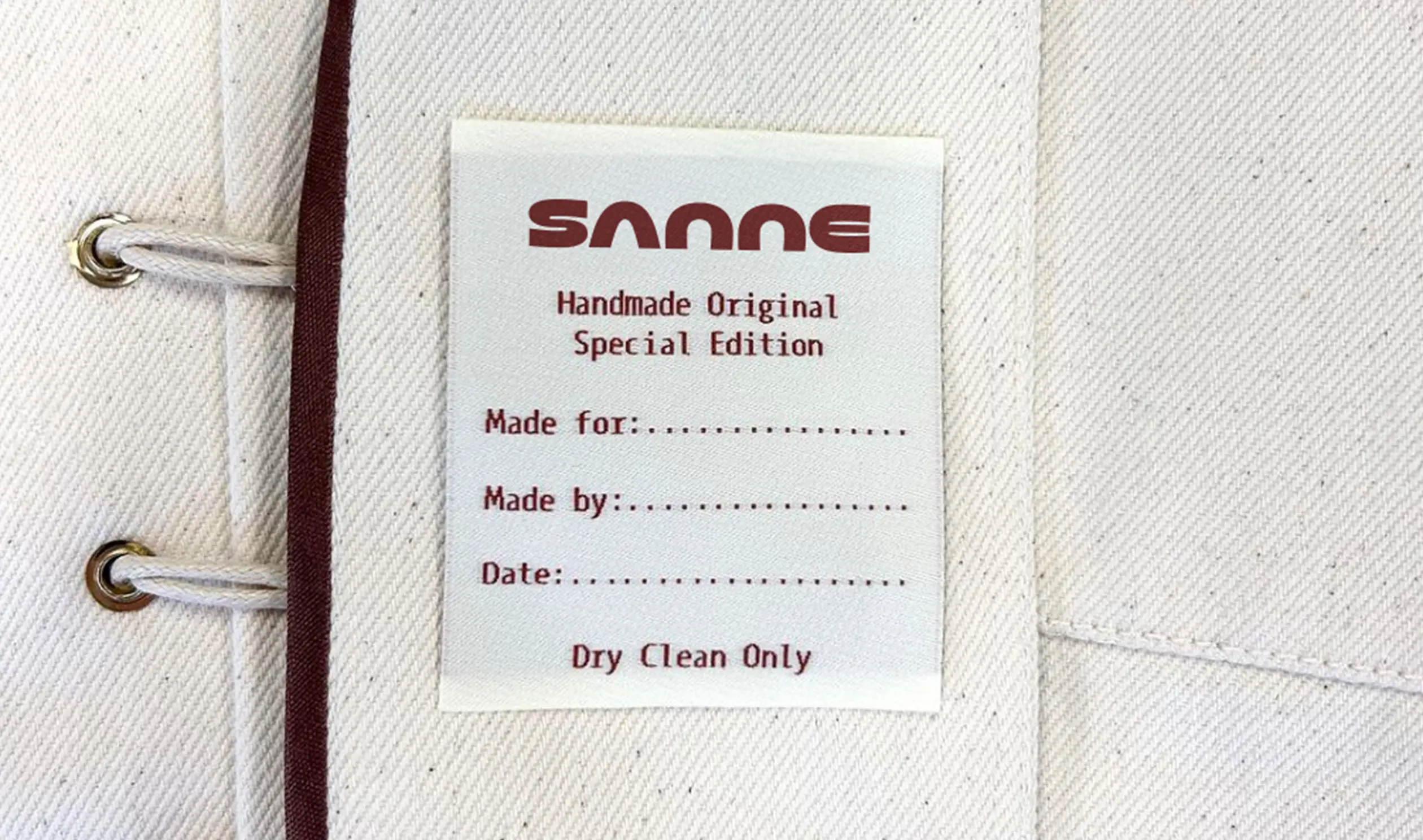
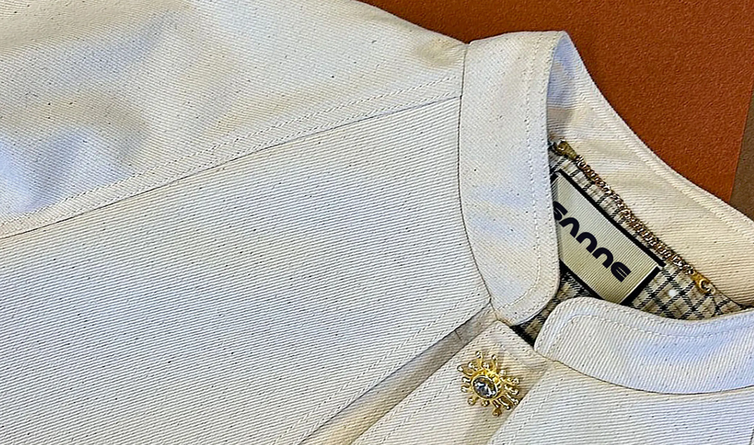
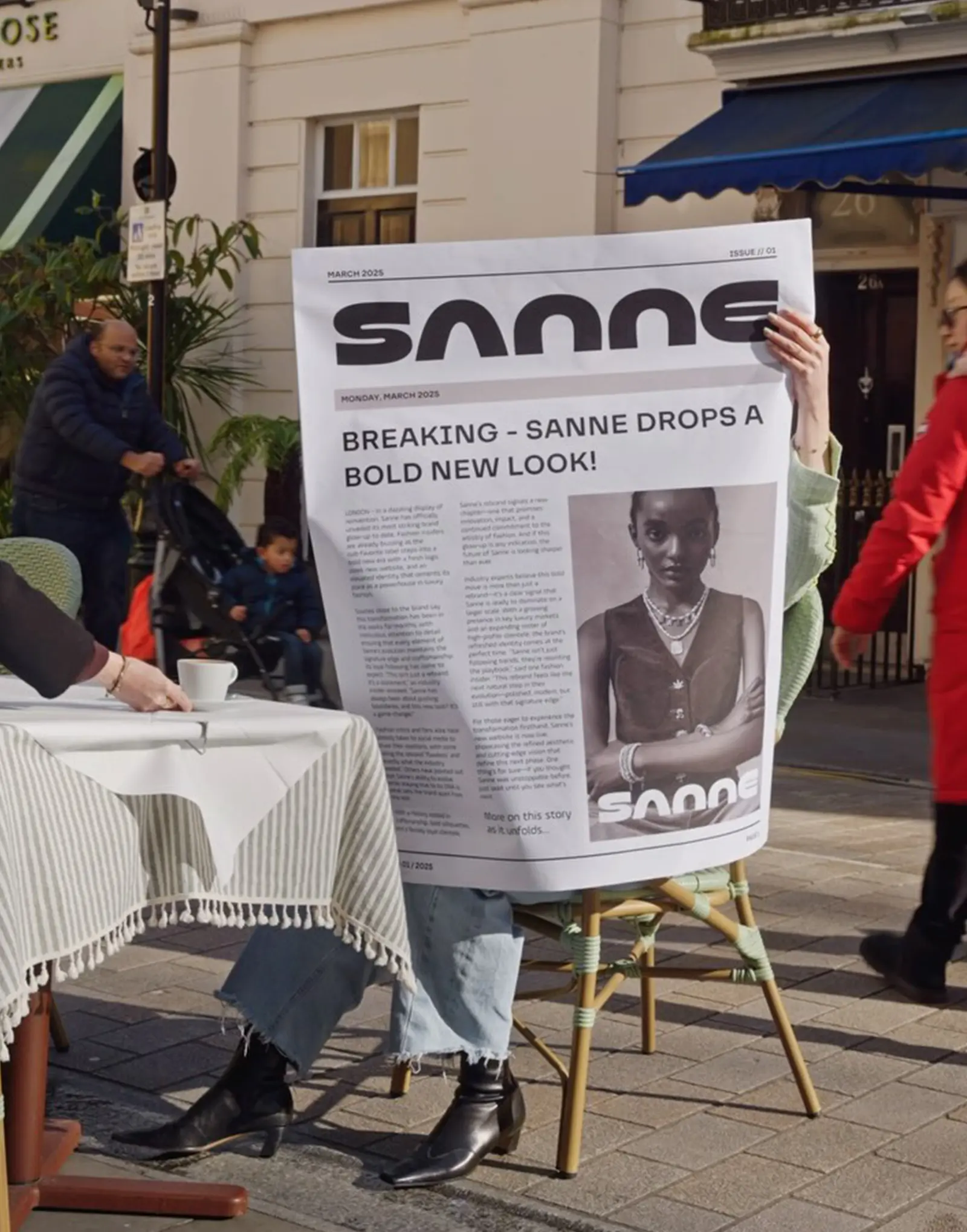
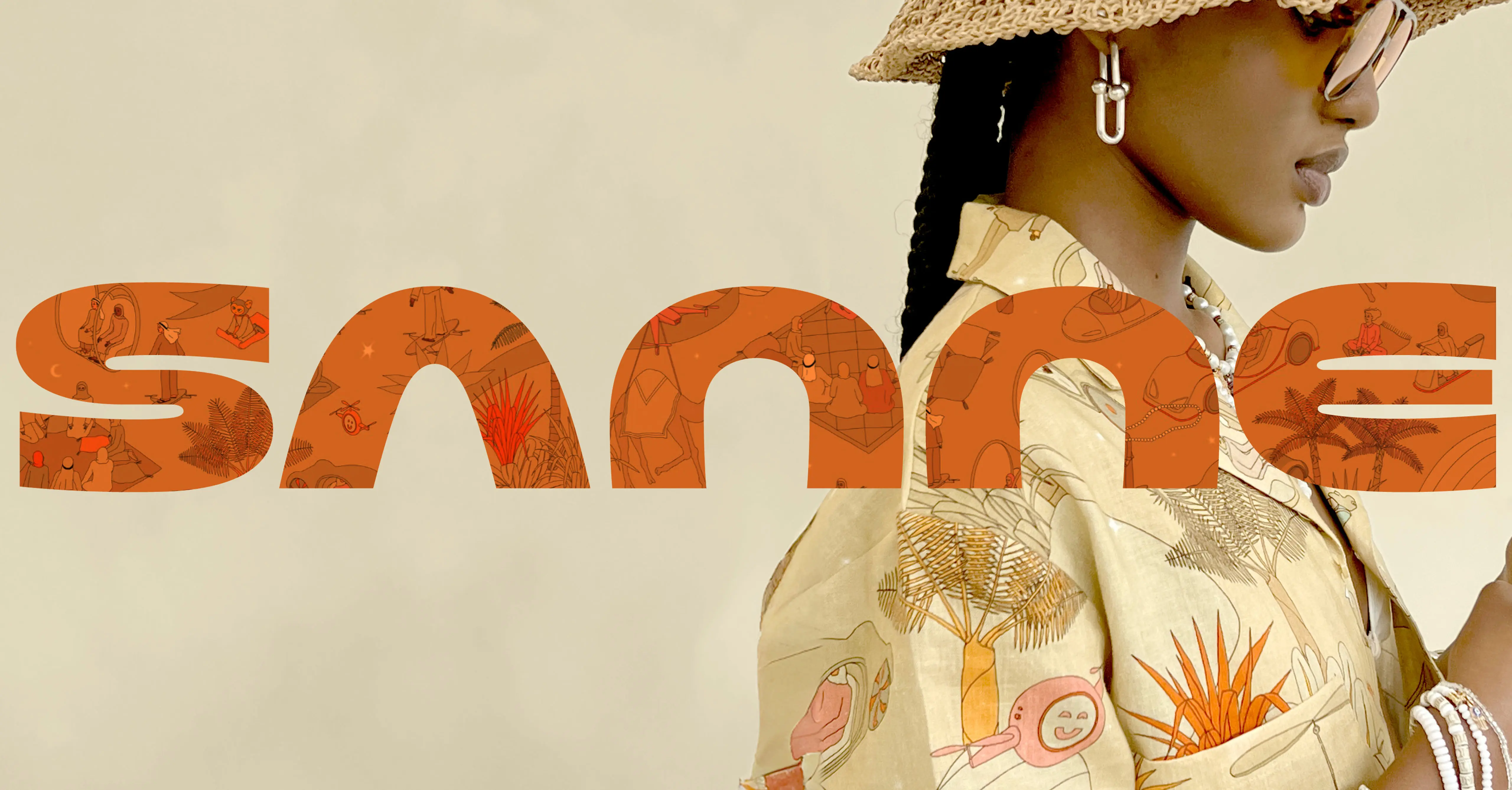
Luxury fashion brand Sanne blends the precision of Savile Row tailoring with the expressive energy of space-age futurism and retro pop culture. LAYER created a dual-logo brand identity system that reflects this distinct fusion, with a wordmark and seal that are luxurious yet progressive.
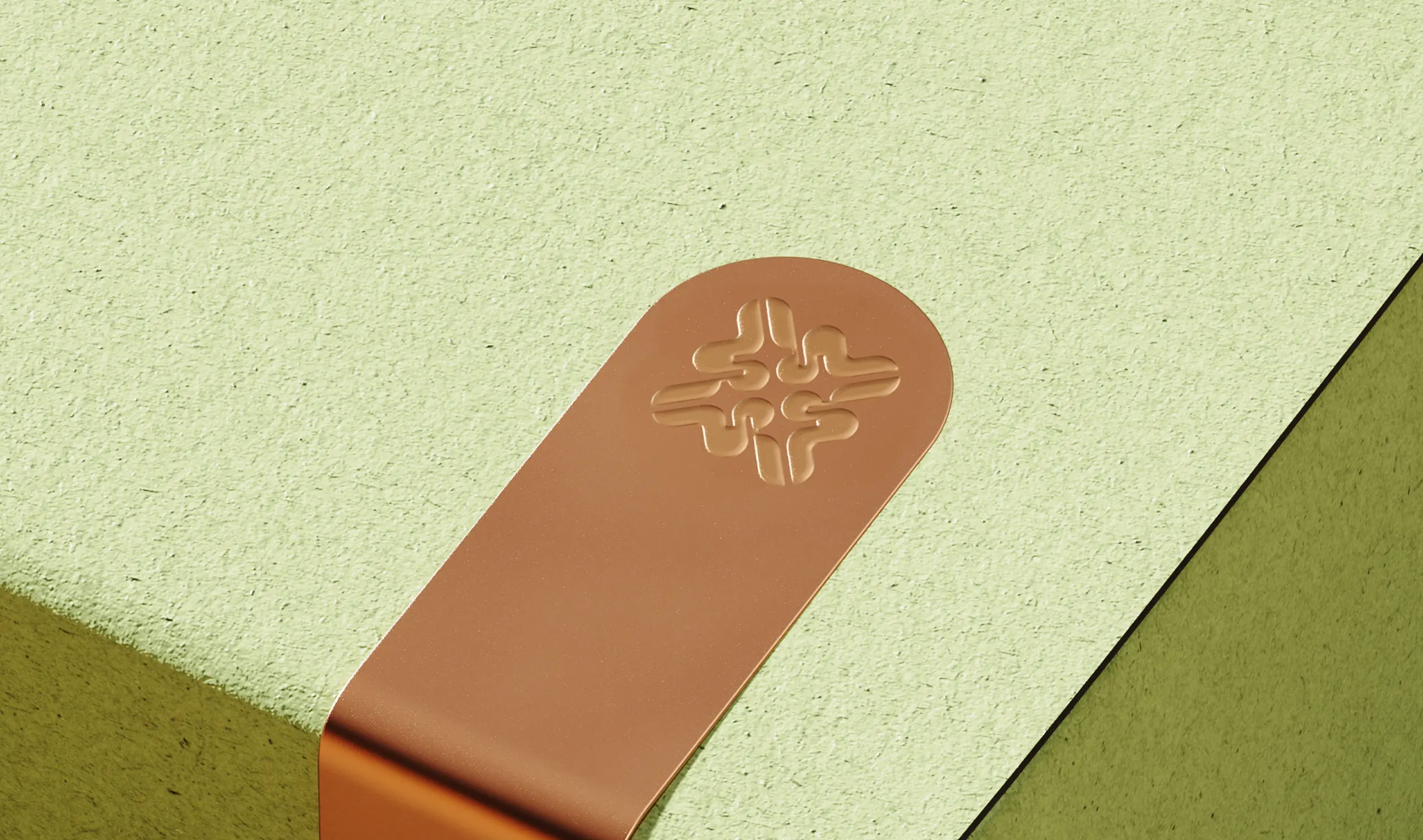
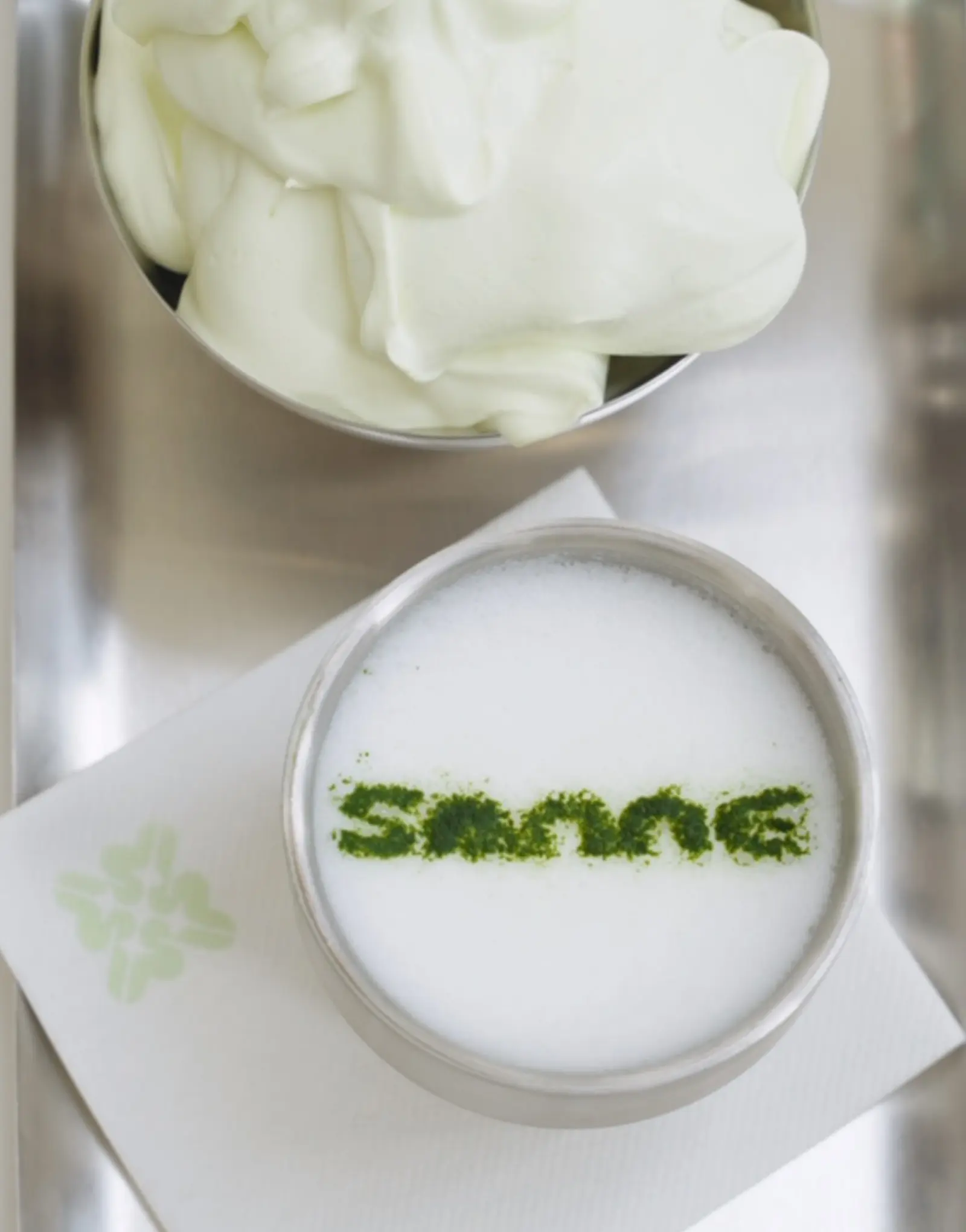
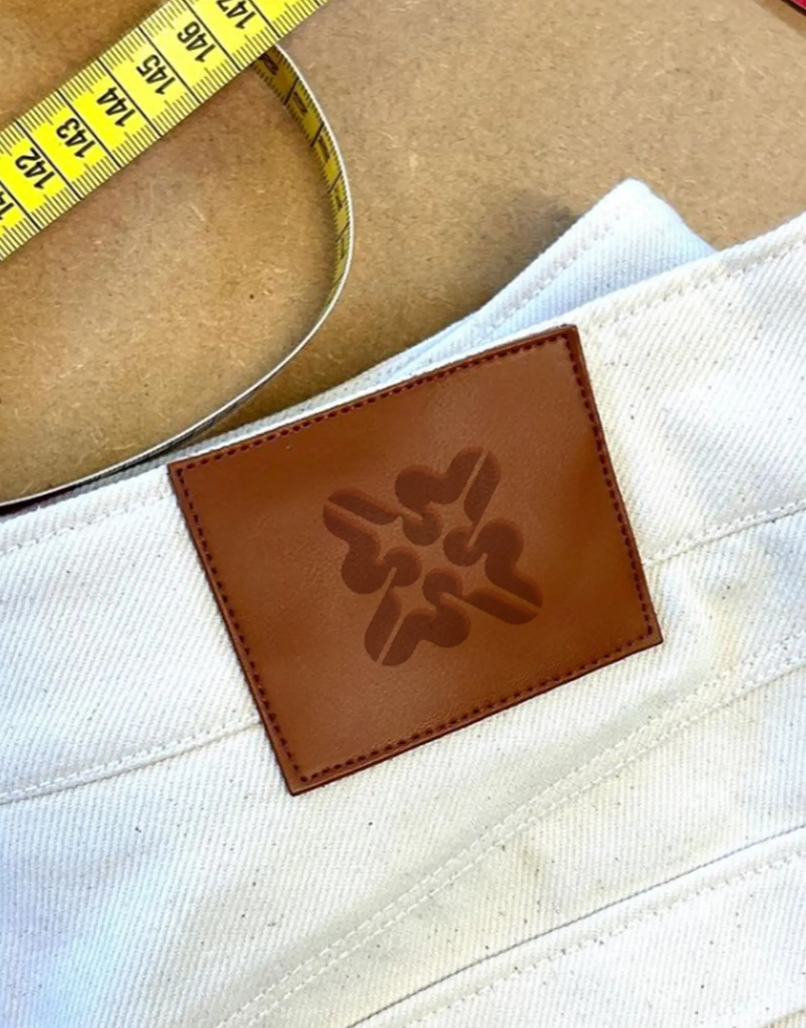
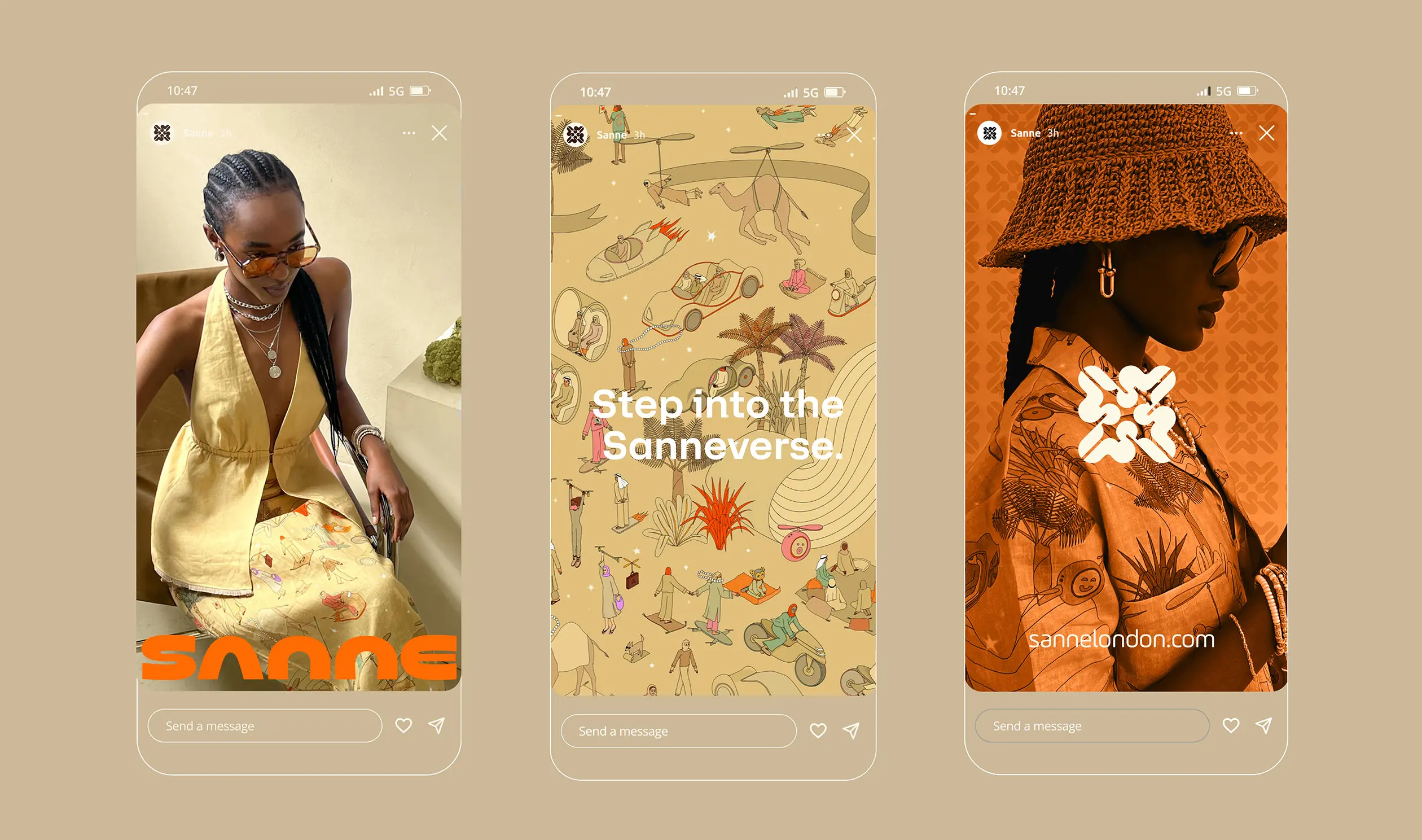
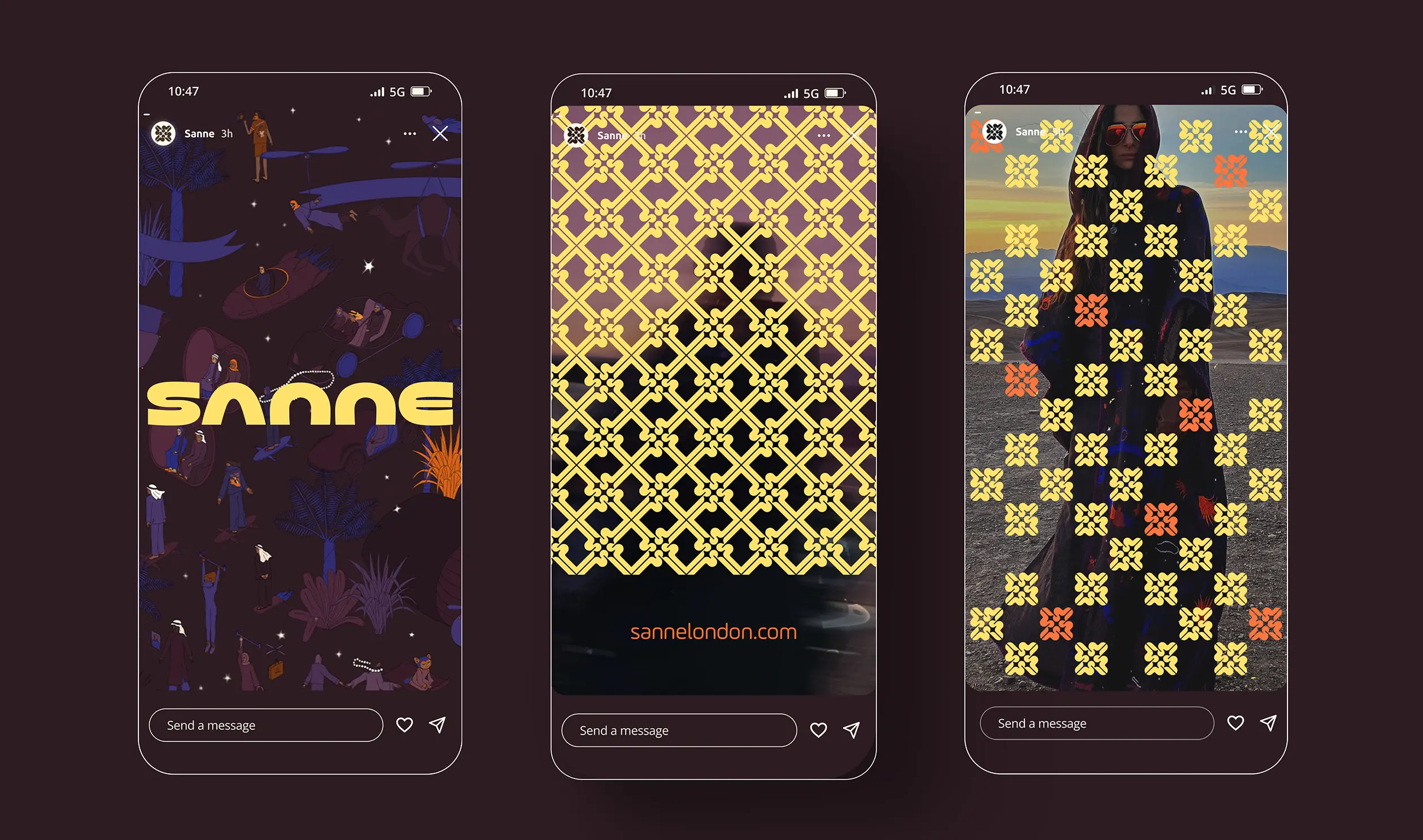
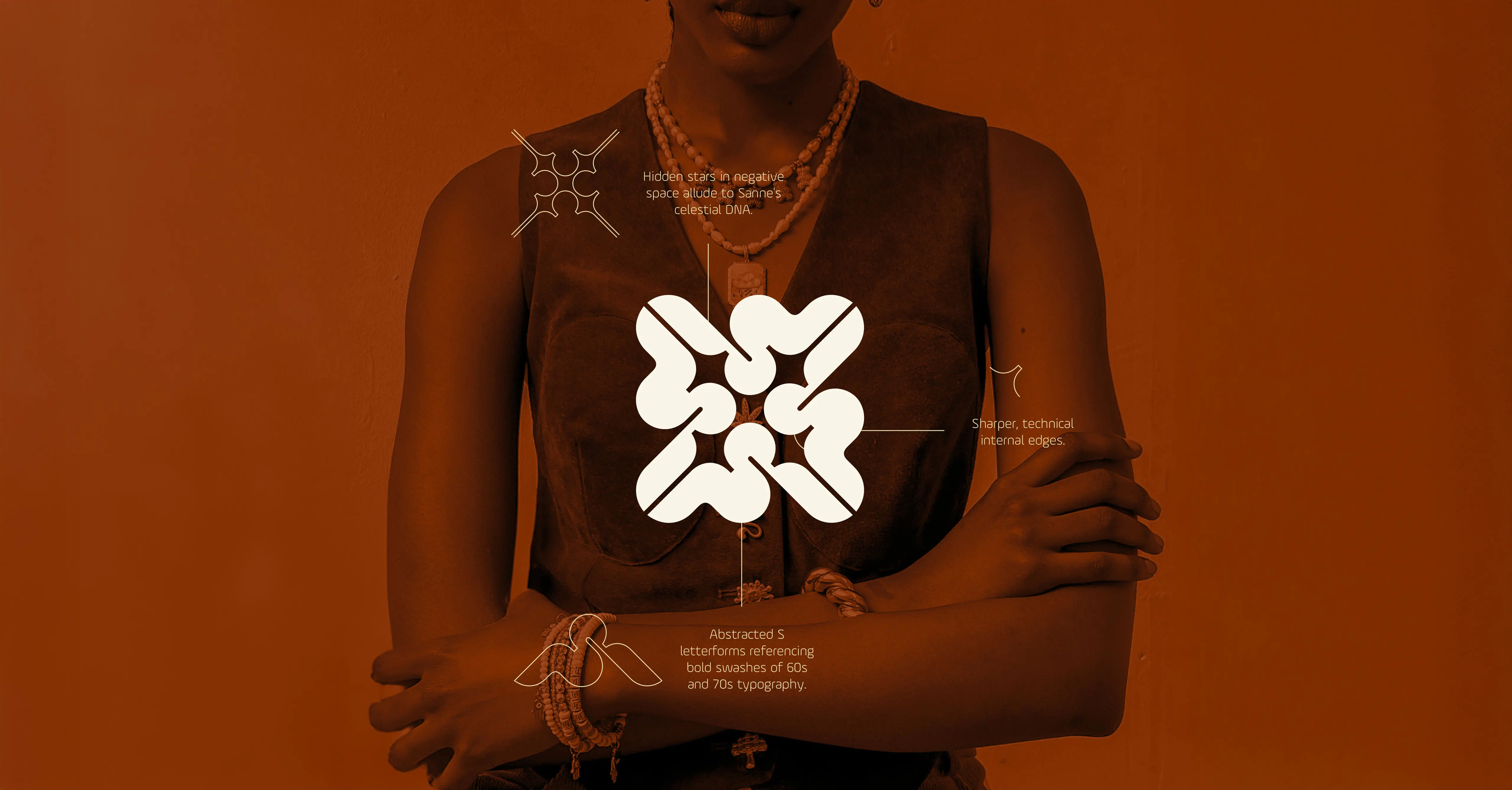
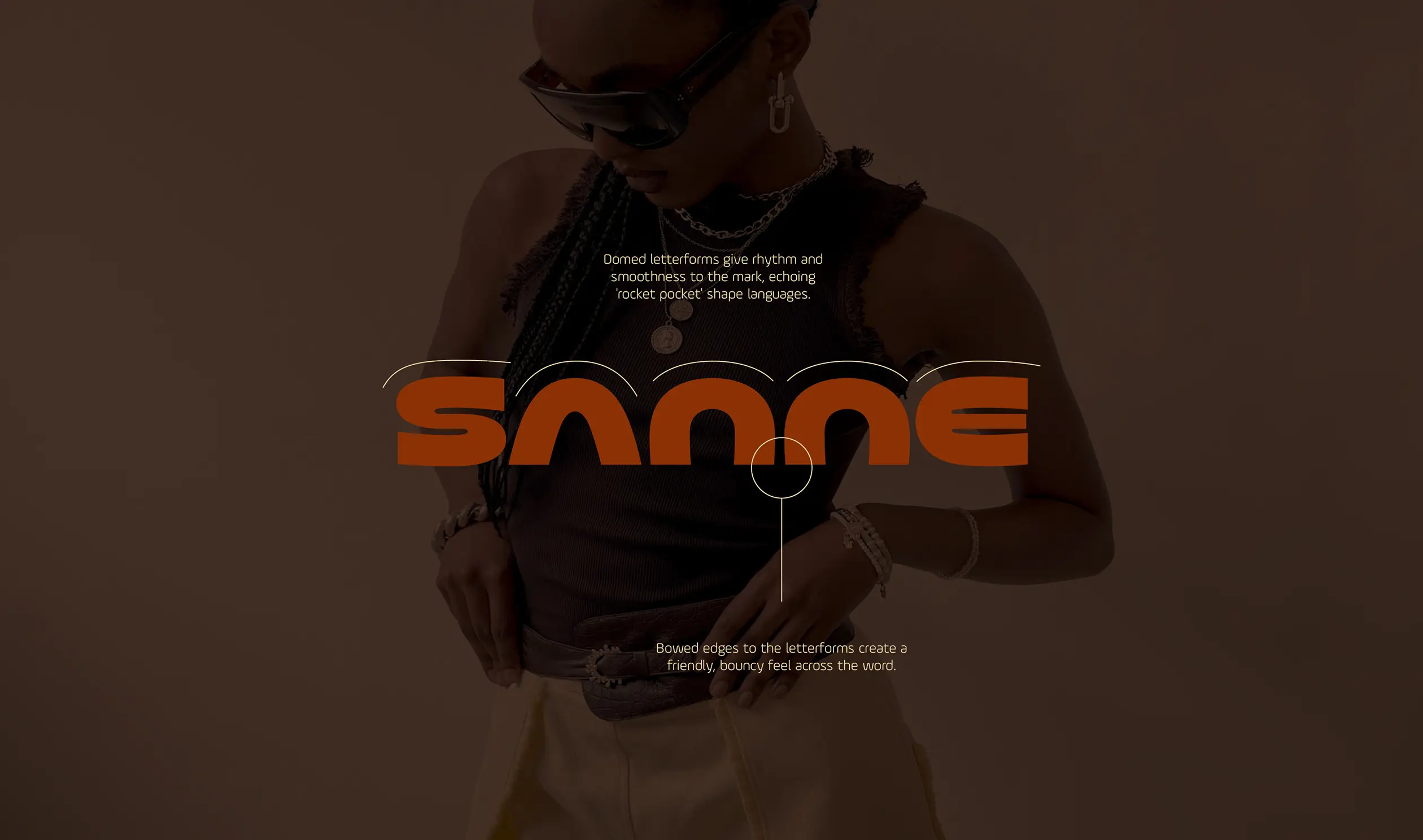
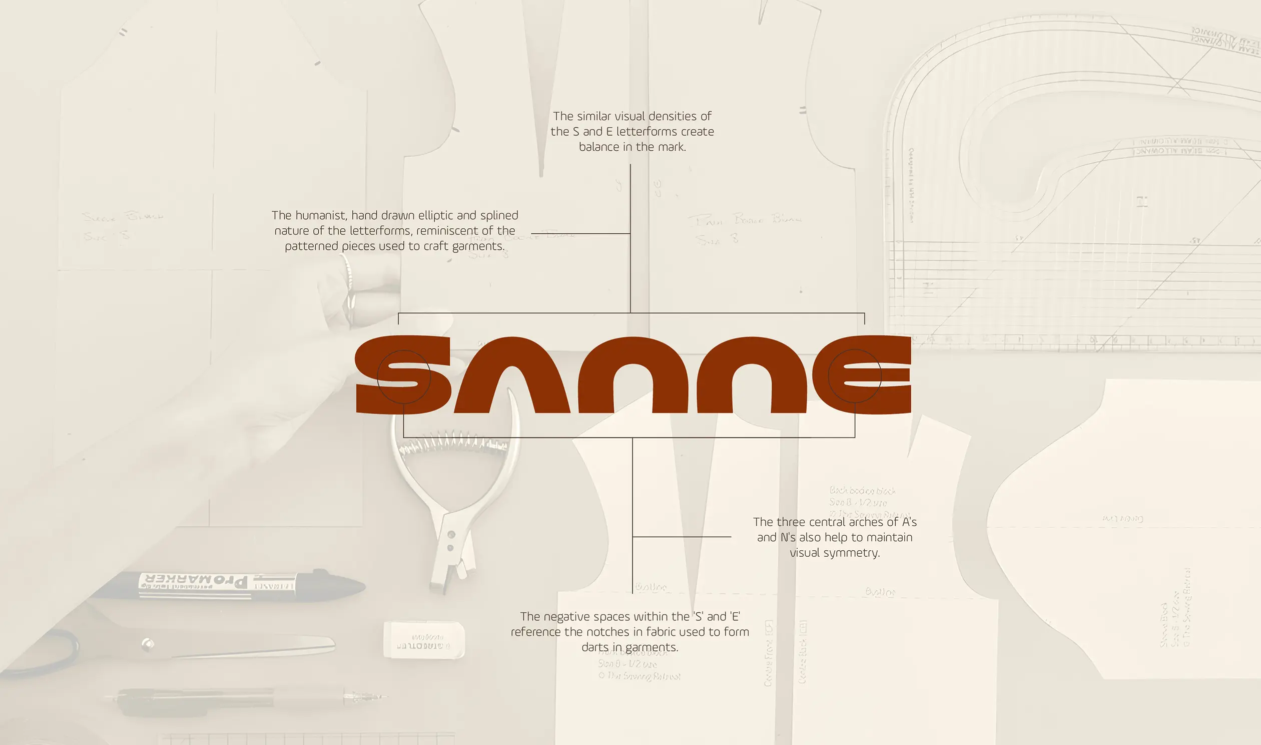
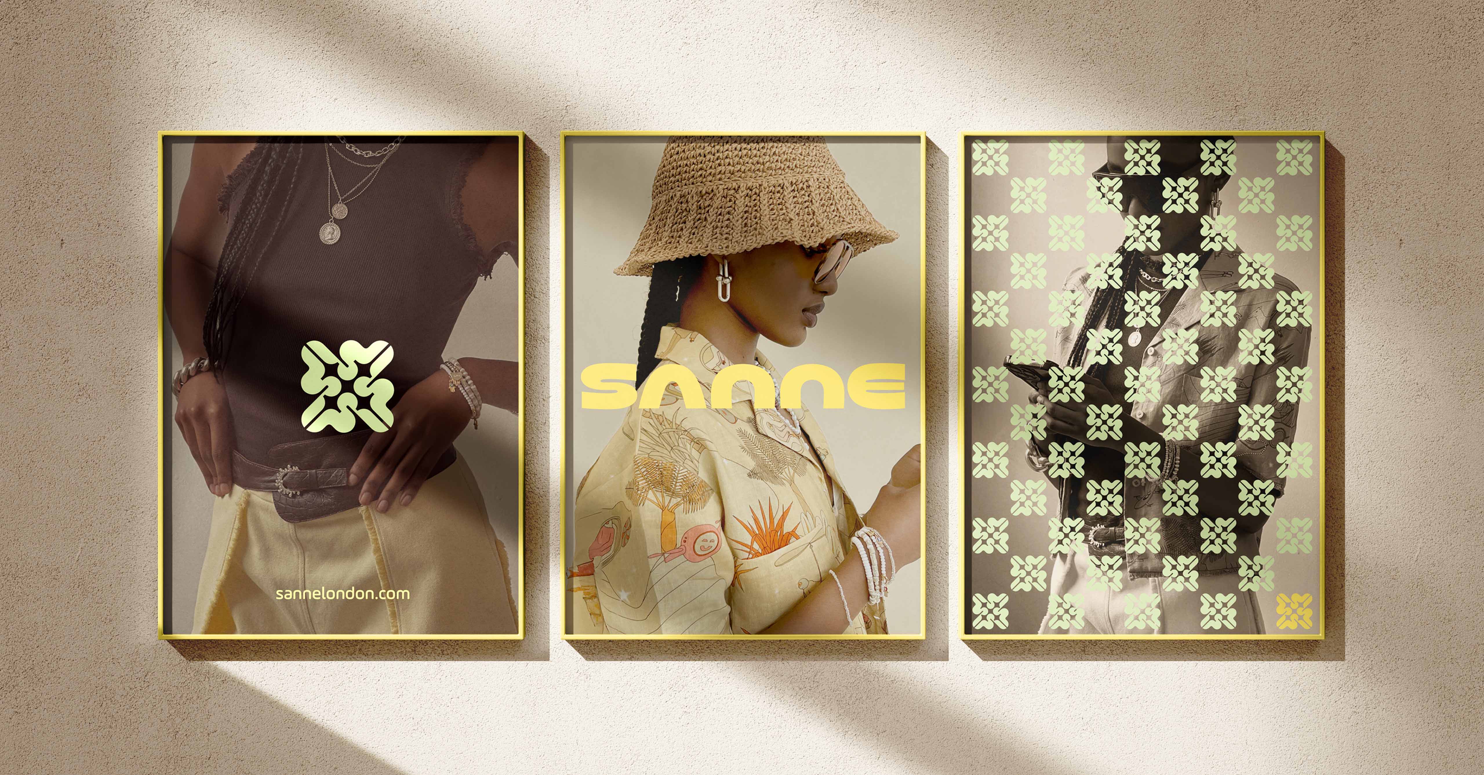
The primary wordmark is inspired by the sculptural geometry of 60s and 70s logotypes, with subtle cues from bespoke pattern-cutting and retrofuturism. Confident and minimal, it captures Sanne’s uncompromising design language. Complementing this is the Sanne seal – a craft-led mark that evokes carved reliefs, emblems and stamps of quality. It’s designed for layered expression and can be used in a variety of ways, from subtle surface details to pattern and bold interior gestures for retail spaces.
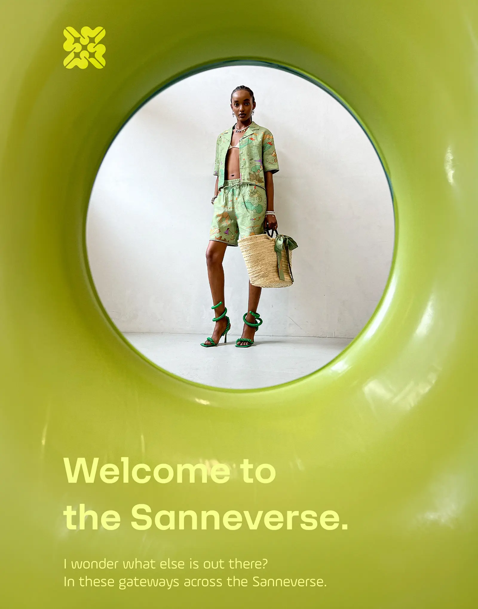
The broader visual identity system includes a vibrant palette, motion graphics and an adaptable typography framework that brings the brand to life across packaging, digital, and physical spaces. This identity is designed to adapt with the brand’s evocative narrative campaigns and always puts the wearer at the centre.